Building an AR room-scanning app
Building an AR room-scanning app
Building an AR room-scanning app
Empowering CITY Furniture's customers to visualize their space and make informed buying decisions.
Empowering CITY Furniture's customers to visualize their space and make informed buying decisions.
Empowering CITY Furniture's customers to visualize their space and make informed buying decisions.
My Role
My Role
My Role
Digital Product Designer
Digital Product Designer
Digital Product Designer
Collaborators
Collaborators
Collaborators
C-Suite Stakeholders
C-Suite Stakeholders, Product Managers, Business Analysts, Developers
C-Suite Stakeholders, Product Managers, Business Analysts, Developers
Product Manager
Business Analysts
Developers
Tools
Tools
Tools
Figma
Figma, Figjam, Jira
Figma, Figjam, Jira
Figjam
Jira
Year
Year
Year
2024
2024
2024
Overview
Overview
Overview
CITY Furniture is Florida's leading brick & mortar and e-commerce furniture company.
CITY Furniture is Florida's leading brick & mortar and e-commerce furniture company.
CITY Furniture is Florida's leading brick & mortar and e-commerce furniture company.
💻
~150K
~150K
~150K
Online customers
Online customers
Online customers
🛒
14%+
14%+
14%+
'21-'23 Return rate
'21-'23 Return rate
'21-'23 Return rate
🏠
50+
50+
50+
Physical locations
Physical locations
Physical locations
This project aimed to reduce returns from online customers due to sizing, decor mismatch, and overall dissatisfaction from online purchases that surged post-covid.
This project aimed to reduce returns from online customers due to sizing, decor mismatch, and overall dissatisfaction from online purchases that surged post-covid.
This project aimed to reduce returns from online customers due to sizing, decor mismatch, and overall dissatisfaction from online purchases that surged post-covid.
This case study follows the journey of how the design team tackled this issue and designed a product that was developed but, ultimately never made it to market. A multi-year, cross-functional effort that involved collaboration with stakeholders, engineers, and our customers.
This case study follows the journey of how the design team tackled this issue and designed a product that was developed but, ultimately never made it to market. A multi-year, cross-functional effort that involved collaboration with stakeholders, engineers, and our customers.
This case study follows the journey of how the design team tackled this issue and designed a product that was developed but, ultimately never made it to market. A multi-year, cross-functional effort that involved collaboration with stakeholders, engineers, and our customers.
Contributions
Contributions
Contributions
01
01
01
Led the end-to-end design efforts on a high-priority project directly overseen by senior leadership, including the VP of Creative and CEO.
Led the end-to-end design efforts on a high-priority project directly overseen by senior leadership, including the VP of Creative and CEO.
Led the end-to-end design efforts on a high-priority project directly overseen by senior leadership, including the VP of Creative and CEO.
02
02
02
Partnered with cross-functional stakeholders to overcome constraints and establish the design direction for the app.
Partnered with cross-functional stakeholders to overcome constraints and establish the design direction for the app.
Partnered with cross-functional stakeholders to overcome constraints and establish the design direction for the app.
03
03
03
Worked hand in hand with the UX research team to uncover vital customer expectations when purchasing furniture online.
Worked hand in hand with the UX research team to uncover vital customer expectations when purchasing furniture online.
Worked hand in hand with the UX research team to uncover vital customer expectations when purchasing furniture online.
Problem
Problem
Problem
01
01
01
Our return rates surged above industry average
Our return rates surged above industry average
Our return rates surged above industry average
With customers opting to exclusively shopping online rather than in-store post-covid our return rates raised dramatically.
With customers opting to exclusively shopping online rather than in-store post-covid our return rates raised dramatically.
With customers opting to exclusively shopping online rather than in-store post-covid our return rates raised dramatically.
02
02
02
Customers expressed disappointment publicly
Customers expressed disappointment publicly
Customers expressed disappointment publicly
Lead times post-covid varied from weeks to months due to supply chain issues well into early 2024. As a result when customers finally received products and it didn't meet their expectations (due to sizing, style, etc.) they would express it via reviews.
Lead times post-covid varied from weeks to months due to supply chain issues well into early 2024. As a result when customers finally received products and it didn't meet their expectations (due to sizing, style, etc.) they would express it via reviews.
Lead times post-covid varied from weeks to months due to supply chain issues well into early 2024. As a result when customers finally received products and it didn't meet their expectations (due to sizing, style, etc.) they would express it via reviews.
03
03
03
Efforts to remedy pain points on PDP only helped slightly
Efforts to remedy pain points on PDP only helped slightly
Efforts to remedy pain points on PDP only helped slightly
Efforts were made to accurately depict dimensions, colors, etc. on our product display pages but this only slightly aided our return rates. Our customers were accustomed to seeing our products in person before purchasing.
Efforts were made to accurately depict dimensions, colors, etc. on our product display pages but this only slightly aided our return rates. Our customers were accustomed to seeing our products in person before purchasing.
Efforts were made to accurately depict dimensions, colors, etc. on our product display pages but this only slightly aided our return rates. Our customers were accustomed to seeing our products in person before purchasing.
Solution
Solution
Solution
Room builder and AR scanning app to depict products in customers homes
Room builder and AR scanning app to depict products in customers homes
Room builder and AR scanning app to depict products in customers homes
As part of this case study I'll focus solely on the AR scanning companion app.
As part of this case study I'll focus solely on the AR scanning companion app.
As part of this case study I'll focus solely on the AR scanning companion app.
Impact
Impact
Impact
🛒
5% return rate decrease
5% return rate decrease
5% return rate decrease
Hypothetical estimate
Hypothetical estimate
Hypothetical estimate
Due to the product being discontinued this is the teams estimated potential impact this could have had on our return rate.
Due to the product being discontinued this is the teams estimated potential impact this could have had on our return rate.
Due to the product being discontinued this is the teams estimated potential impact this could have had on our return rate.
The Process
The Process
The Process
Competitive Analysis
Competitive Analysis
Competitive Analysis
What do competitors do?
What do competitors do?
What do competitors do?
01
01
01
3D Room building software
3D Room building software
3D Room building software
Most of our competitors already had software to populate their products in scanned or created spaces.
Most of our competitors already had software to populate their products in scanned or created spaces.
Most of our competitors already had software to populate their products in scanned or created spaces.
02
02
02
Scanning tech
Scanning tech
Scanning tech
Accurate 3D mockups could be made by competitors own proprietary scanning products.
Accurate 3D mockups could be made by competitors own proprietary scanning products.
Accurate 3D mockups could be made by competitors own proprietary scanning products.
03
03
03
Instructional user experience
Instructional user experience
Instructional user experience
Most of our competitors already had software to populate their products in scanned or created spaces.
Most of our competitors already had software to populate their products in scanned or created spaces.
Most of our competitors already had software to populate their products in scanned or created spaces.
Initial Constraints
Initial Constraints
Initial Constraints
During the design team's research phase, our development team conducted their own discovery and determined that we would need to rely on Apple's LiDAR technology which restricts compatibility to iOS devices. They also found that a minimum of two scans would be required to generate accurate 3D mockups.
During the design team's research phase, our development team conducted their own discovery and determined that we would need to rely on Apple's LiDAR technology which restricts compatibility to iOS devices. They also found that a minimum of two scans would be required to generate accurate 3D mockups.
During the design team's research phase, our development team conducted their own discovery and determined that we would need to rely on Apple's LiDAR technology which restricts compatibility to iOS devices. They also found that a minimum of two scans would be required to generate accurate 3D mockups.
Even though this wasn't ideal it was average from what we saw when analyzing competitors.
Even though this wasn't ideal it was average from what we saw when analyzing competitors.
Even though this wasn't ideal it was average from what we saw when analyzing competitors.
01
01
Layout scan
Layout scan
One scan was needed to map out the overall dimensions.
One scan was needed to map out the overall dimensions.
02
02
Details scan
Details scan
The second scan was needed to fill in the finer details.
The second scan was needed to fill in the finer details.
User Goals
User Goals
User Goals
What do users need?
What do users need?
What do users need?
Visualization of products
Visualization of products
Visualization of products
By scanning customers' spaces accurately, we can showcase how products will look in their homes, empowering them to make confident buying decisions.
By scanning customers' spaces accurately, we can showcase how products will look in their homes, empowering them to make confident buying decisions.
By scanning customers' spaces accurately, we can showcase how products will look in their homes, empowering them to make confident buying decisions.
Business Goals
Business Goals
Business Goals
What does the business need?
What does the business need?
What does the business need?
Lower return rate
Lower return rate
Lower return rate
Prevent returns caused by incorrect sizing estimates and style mismatches, ultimately reducing our return rate.
Prevent returns caused by incorrect sizing estimates and style mismatches, ultimately reducing our return rate.
Prevent returns caused by incorrect sizing estimates and style mismatches, ultimately reducing our return rate.
Increase conversion
Increase conversion
Increase conversion
Boost customer confidence by visualizing products in their home, reducing hesitation and driving purchases.
Boost customer confidence by visualizing products in their home, reducing hesitation and driving purchases.
Boost customer confidence by visualizing products in their home, reducing hesitation and driving purchases.
Designs
Designs
Designs
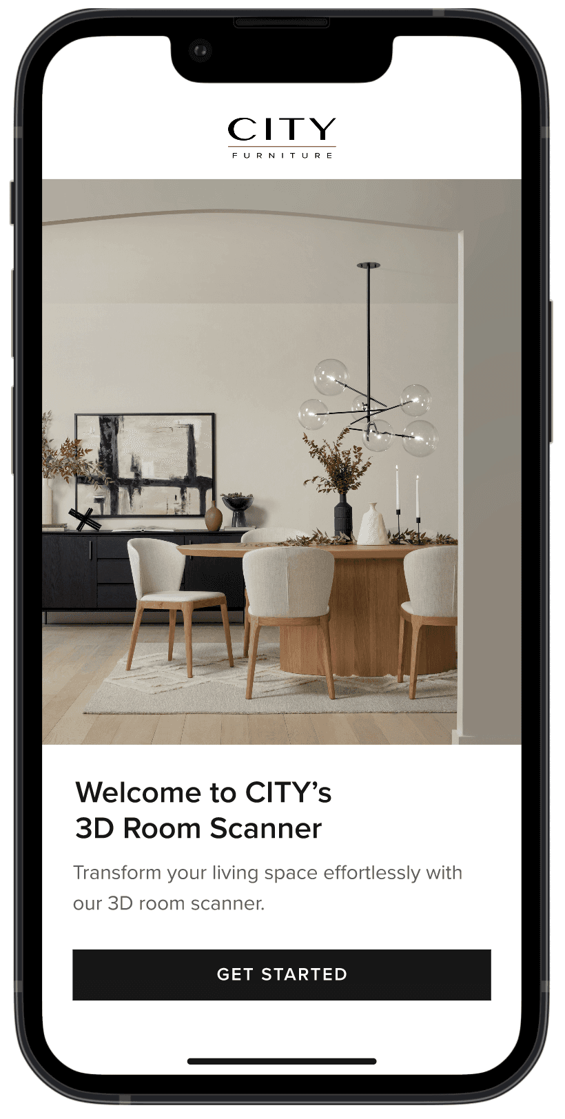
Initial screens
Initial screens
Initial screens
We aimed to create a simple and straightforward experience for customers the moment they open the app, displaying only relevant information and actions.
We aimed to create a simple and straightforward experience for customers the moment they open the app, displaying only relevant information and actions.
We aimed to create a simple and straightforward experience for customers the moment they open the app, displaying only relevant information and actions.


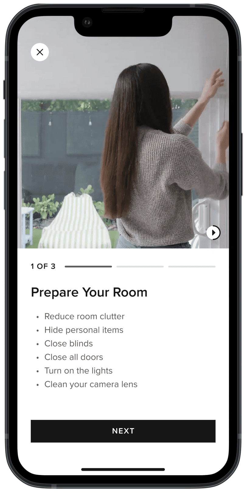
Instructional screens
Instructional screens
Instructional screens
Due to the complexity of room scanning, we included a detailed video guide before the scanning process begins.
Due to the complexity of room scanning, we included a detailed video guide before the scanning process begins.
Due to the complexity of room scanning, we included a detailed video guide before the scanning process begins.
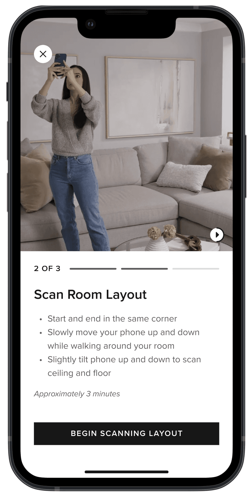

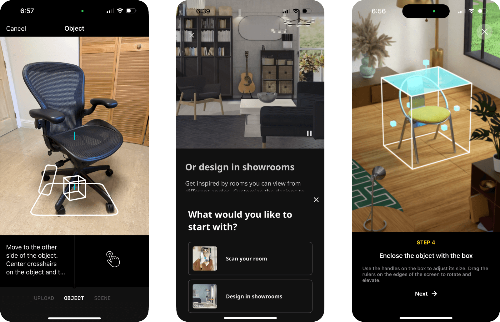
Scanning and confirmation
Scanning and confirmation
Scanning and confirmation
For both scanning processes, we had to use the native UI in Apple's LiDAR software. After each scan, customers could review and confirm the captured mockup.
For both scanning processes, we had to use the native UI in Apple's LiDAR software. After each scan, customers could review and confirm the captured mockup.
For both scanning processes, we had to use the native UI in Apple's LiDAR software. After each scan, customers could review and confirm the captured mockup.


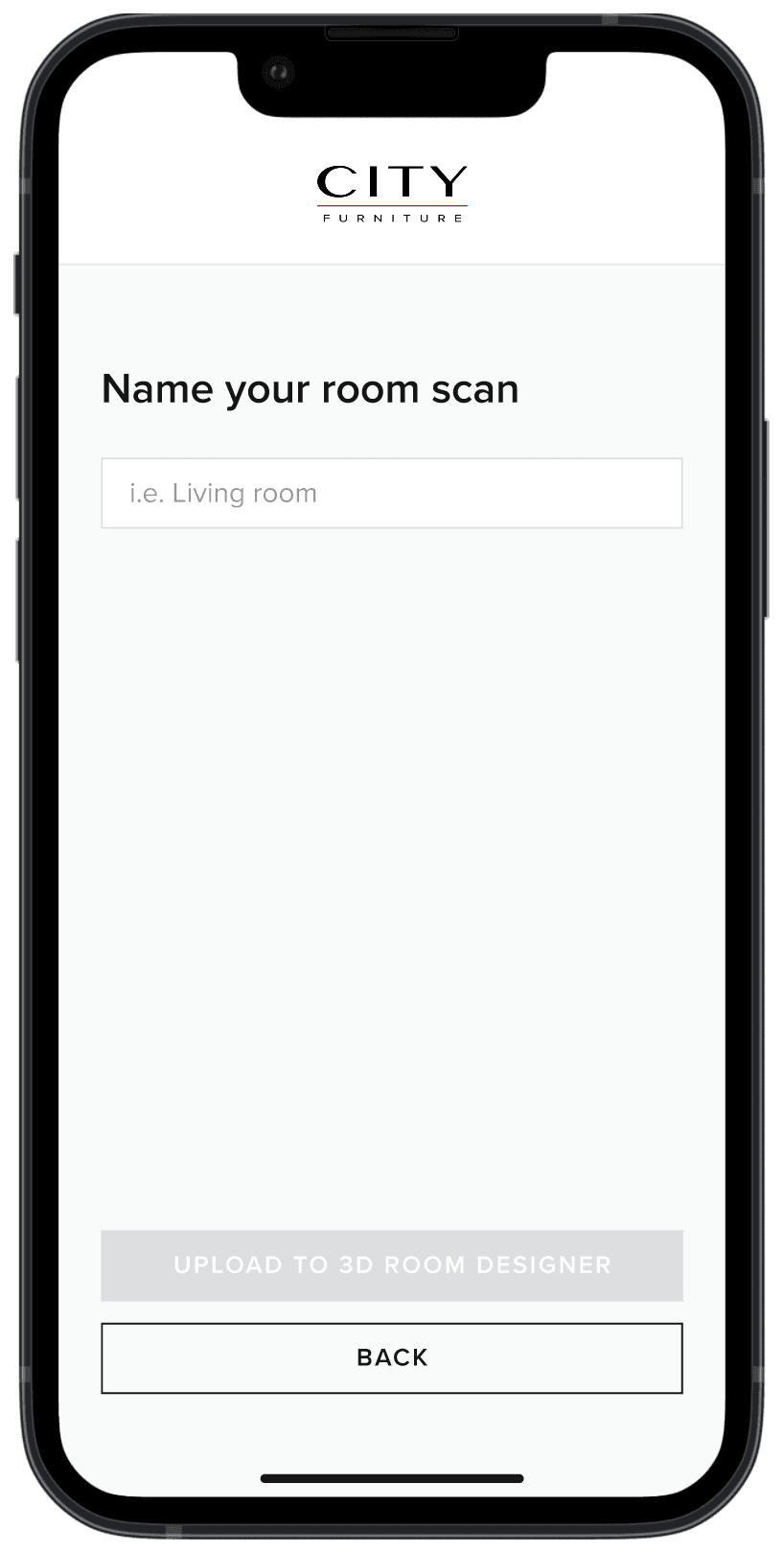
Saving and uploading
Saving and uploading
Saving and uploading
Once scanning is done the customers can name it and upload it to the room builder app.
Once scanning is done the customers can name it and upload it to the room builder app.
Once scanning is done the customers can name it and upload it to the room builder app.

Final design
Final design
Final design
Handoff
Handoff
Handoff
Design 🤝 Development
Design 🤝 Development
Design 🤝 Development
Throughout the process, we embraced an agile approach, ensuring the development team was fully aligned and actively building the framework based on completed work. To further refine the details, we held multiple rounds of meetings at the end of our design phase to meticulously communicate the intended functionality of key interactions and user flows.
Throughout the process, we embraced an agile approach, ensuring the development team was fully aligned and actively building the framework based on completed work. To further refine the details, we held multiple rounds of meetings at the end of our design phase to meticulously communicate the intended functionality of key interactions and user flows.
Throughout the process, we embraced an agile approach, ensuring the development team was fully aligned and actively building the framework based on completed work. To further refine the details, we held multiple rounds of meetings at the end of our design phase to meticulously communicate the intended functionality of key interactions and user flows.
Creative cross-functional collaboration
Creative cross-functional collaboration
Creative cross-functional collaboration
We collaborated closely with the creative team – including photography, video, and communication designers – to ensure users received clear, intuitive guidance for seamless app interaction. This involved creating:
We collaborated closely with the creative team – including photography, video, and communication designers – to ensure users received clear, intuitive guidance for seamless app interaction. This involved creating:
We collaborated closely with the creative team – including photography, video, and communication designers – to ensure users received clear, intuitive guidance for seamless app interaction. This involved creating:
01
01
Environmental shots for the introduction screen
Environmental shots for the introduction screen
Environmental shots for the introduction screen
02
02
Step-by-step instructional videos for the scanning process
Step-by-step instructional videos for the scanning process
Step-by-step instructional videos for the scanning process
03
03
Reference images demonstrating proper phone positioning
Reference images demonstrating proper phone positioning
Reference images demonstrating proper phone positioning
Project retirement
Project retirement
Project retirement
While we took great pride in our app, the rapid pace of technological innovation—and our competitors' relentless advancement ultimately outpaced us. As we refined our two-scan process and polished the user experience, competitors introduced breakthrough features like real-time 3D rendering and AI-driven room customization.
While we took great pride in our app, the rapid pace of technological innovation—and our competitors' relentless advancement ultimately outpaced us. As we refined our two-scan process and polished the user experience, competitors introduced breakthrough features like real-time 3D rendering and AI-driven room customization.
While we took great pride in our app, the rapid pace of technological innovation—and our competitors' relentless advancement ultimately outpaced us. As we refined our two-scan process and polished the user experience, competitors introduced breakthrough features like real-time 3D rendering and AI-driven room customization.
Despite our best efforts, these developments made our solution feel dated. After careful consideration, we made the difficult decision to sunset the project and reallocate our resources to more promising initiatives. Though bittersweet, this strategic pivot ultimately positioned us for greater opportunities.
Despite our best efforts, these developments made our solution feel dated. After careful consideration, we made the difficult decision to sunset the project and reallocate our resources to more promising initiatives. Though bittersweet, this strategic pivot ultimately positioned us for greater opportunities.
Despite our best efforts, these developments made our solution feel dated. After careful consideration, we made the difficult decision to sunset the project and reallocate our resources to more promising initiatives. Though bittersweet, this strategic pivot ultimately positioned us for greater opportunities.
Learnings
Learnings
Learnings
01
01
01
Be nimble in all aspects of product creation.
Be nimble in all aspects of product creation.
Be nimble in all aspects of product creation.
02
02
02
Effective cross-functional collaboration is what makes or breaks good design.
Effective cross-functional collaboration is what makes or breaks good design.
Effective cross-functional collaboration is what makes or breaks good design.
03
03
03
Utilize constraints as points of innovation.
Utilize constraints as points of innovation.
Utilize constraints as points of innovation.
© Jaime Carrasco 2025 – Made in the U.S.A.
© Jaime Carrasco 2025 – Made in the U.S.A.
© Jaime Carrasco 2025 – Made in the U.S.A.
© Jaime Carrasco 2025 – Made in the U.S.A.