Redesigning a product listing page
Redesigning a product listing page
Redesigning a product listing page
Helping CITY Furniture customers find the products they need through thoughtful design improvements.
Helping CITY Furniture customers find the products they need through thoughtful design improvements.
Helping CITY Furniture customers find the products they need through thoughtful design improvements.
My Role
My Role
My Role
Digital Product Designer
Digital Product Designer
Digital Product Designer
Collaborators
Collaborators
Collaborators
Product Manager
Business Analysts
Developers
Tools
Tools
Tools
Figma
Figma, Figjam, Jira
Figma, Figjam, Jira
Jira
Year
Year
Year
2024
2024
2024
Overview
Overview
Overview
CITY Furniture is a furniture based retailer based in Florida with a growing e-commerce presence.
CITY Furniture is a furniture based retailer based in Florida with a growing e-commerce presence.
CITY Furniture is a furniture based retailer based in Florida with a growing e-commerce presence.
📈
3.5%+
3.5%+
3.5%+
Conversion
Conversion
Conversion
📉
-3.2%
Bounce rate
Bounce rate
Bounce rate
⏱️
6.4%+
6.4%+
6.4%+
Average time on page
Average time on page
Average time on page
This case study covers the improvements made to the product listing pages as part of a larger website optimization project to improve various online touchpoints.
This case study covers the improvements made to the product listing pages as part of a larger website optimization project to improve various online touchpoints.
This case study covers the improvements made to the product listing pages as part of a larger website optimization project to improve various online touchpoints.
Through a series of intentional changes we achieved a 3.5% increase in conversion rates, a 3.2% reduction in bounce rates, and a 6.4% increase in average time spent on our PLP pages.
Through a series of intentional changes we achieved a 3.5% increase in conversion rates, a 3.2% reduction in bounce rates, and a 6.4% increase in average time spent on our PLP pages.
Through a series of intentional changes we achieved a 3.5% increase in conversion rates, a 3.2% reduction in bounce rates, and a 6.4% increase in average time spent on our PLP pages.
Contributions
Contributions
Contributions
01
01
01
Spearheaded the project launch, driving the team towards solving key user challenges and ensuring a successful outcome.
Spearheaded the project launch, driving the team towards solving key user challenges and ensuring a successful outcome.
Spearheaded the project launch, driving the team towards solving key user challenges and ensuring a successful outcome.
02
02
02
Partnered cross-functionally with UX research to assist in uncovering and exposing key user pain points.
Partnered cross-functionally with UX research to assist in uncovering and exposing key user pain points.
Partnered cross-functionally with UX research to assist in uncovering and exposing key user pain points.
03
03
03
Worked closely with stakeholders to iteratively refine product strategy, balancing user needs with business goals.
Worked closely with stakeholders to iteratively refine product strategy, balancing user needs with business goals.
Worked closely with stakeholders to iteratively refine product strategy, balancing user needs with business goals.
Problem
Problem
Problem
01
01
01
Cluttered navigation
Cluttered navigation
Cluttered navigation
Top-heavy menu structure consumed valuable screen real estate.
Top-heavy menu structure consumed valuable screen real estate.
Top-heavy menu structure consumed valuable screen real estate.
02
02
02
Inefficient product display
Inefficient product display
Inefficient product display
The grid layout made products feel cramped, reduced image sizes, and had redundant product listings.
The grid layout made products feel cramped, reduced image sizes, and had redundant product listings.
The grid layout made products feel cramped, reduced image sizes, and had redundant product listings.
03
03
03
Complex filtering
Complex filtering
Complex filtering
Filterings included rarely used options and lacked intuitive organization.
Filterings included rarely used options and lacked intuitive organization.
Filterings included rarely used options and lacked intuitive organization.
Solution
Solution
Solution
Redesigned PLP experience (filtering, product cards, and grid)
Redesigned PLP experience (filtering, product cards, and grid)
Redesigned PLP experience (filtering, product cards, and grid)
We tackled every user pain point head on and delivered an improved e-commerce experience.
We tackled every user pain point head on and delivered an improved e-commerce experience.
We tackled every user pain point head on and delivered an improved e-commerce experience.

Impact
Impact
Impact
📈
Improved numbers on 3 KPIs
Improved numbers on 3 KPIs
Improved numbers on 3 KPIs
Through our updates we achieved a 3.5% increase in conversion rates, a 3.2% reduction in bounce rates, and a 6.4% increase in average time spent on our PLP pages.
Through our updates we achieved a 3.5% increase in conversion rates, a 3.2% reduction in bounce rates, and a 6.4% increase in average time spent on our PLP pages.
Through our updates we achieved a 3.5% increase in conversion rates, a 3.2% reduction in bounce rates, and a 6.4% increase in average time spent on our PLP pages.
The Process
The Process
The Process
Competitive Analysis
Competitive Analysis
Competitive Analysis
What do competitors do?
What do competitors do?
What do competitors do?
01
01
01
Traditional left sided filtering
Traditional left sided filtering
Traditional left sided filtering
Top positioned navigation was very uncommon. All of our competitors utilized a left sided filtering options on PLP.
Top positioned navigation was very uncommon. All of our competitors utilized a left sided filtering options on PLP.
Top positioned navigation was very uncommon. All of our competitors utilized a left sided filtering options on PLP.
02
02
02
Limited products to 2 or 3 per row
Limited products to 2 or 3 per row
Limited products to 2 or 3 per row
In an effort to showcase products visually competitors limited rows to 2 or 3 products.
In an effort to showcase products visually competitors limited rows to 2 or 3 products.
In an effort to showcase products visually competitors limited rows to 2 or 3 products.
03
03
03
Condensed multiple listings into single product cards
Condensed multiple listings into single product cards
Condensed multiple listings into single product cards
Instead of having multiple listings for the same product in different colors or fabrics they had fewer listings with options to view configurations in a single product card.
Instead of having multiple listings for the same product in different colors or fabrics they had fewer listings with options to view configurations in a single product card.
Instead of having multiple listings for the same product in different colors or fabrics they had fewer listings with options to view configurations in a single product card.


UX research collaboration
UX research collaboration
UX research collaboration
Our UX team added qualitative insights by interviewing 5 CITY Furniture customers from different backgrounds. Key pain points emerged:
Our UX team added qualitative insights by interviewing 5 CITY Furniture customers from different backgrounds. Key pain points emerged:
Our UX team added qualitative insights by interviewing 5 CITY Furniture customers from different backgrounds. Key pain points emerged:
Overwhelming navigation with too many options
Frustration over what looked like duplicate products (often just color variants)
Difficulty finding items with filters
Overwhelming navigation with too many options
Frustration over what looked like duplicate products (often just color variants)
Difficulty finding items with filters
Overwhelming navigation with too many options
Frustration over what looked like duplicate products (often just color variants)
Difficulty finding items with filters
One participant put it perfectly: 'I feel like I'm seeing the same sofa twenty times just because it comes in different colors.'
One participant put it perfectly: 'I feel like I'm seeing the same sofa twenty times just because it comes in different colors.'
One participant put it perfectly: 'I feel like I'm seeing the same sofa twenty times just because it comes in different colors.'
User Goals
User Goals
User Goals
What do users need?
What do users need?
What do users need?
Clarity and ease while browsing products.
Clarity and ease while browsing products.
Clarity and ease while browsing products.
Users want a simple and efficient way to explore products. Cluttered displays and redundant options slow them down and create frustration.
Users want a simple and efficient way to explore products. Cluttered displays and redundant options slow them down and create frustration.
Users want a simple and efficient way to explore products. Cluttered displays and redundant options slow them down and create frustration.
Business Goals
Business Goals
Business Goals
What does the business need?
What does the business need?
What does the business need?
Increase conversion
Increase conversion
Increase conversion
The business needs to reduce friction in the shopping journey to improve conversions and average order value.
The business needs to reduce friction in the shopping journey to improve conversions and average order value.
The business needs to reduce friction in the shopping journey to improve conversions and average order value.
Promote intuitive discoverability
Promote intuitive discoverability
Promote intuitive discoverability
A wide selection demands effortless access to home solutions, minimizing product listing page navigation friction.
A wide selection demands effortless access to home solutions, minimizing product listing page navigation friction.
A wide selection demands effortless access to home solutions, minimizing product listing page navigation friction.
Designs
Designs
Designs
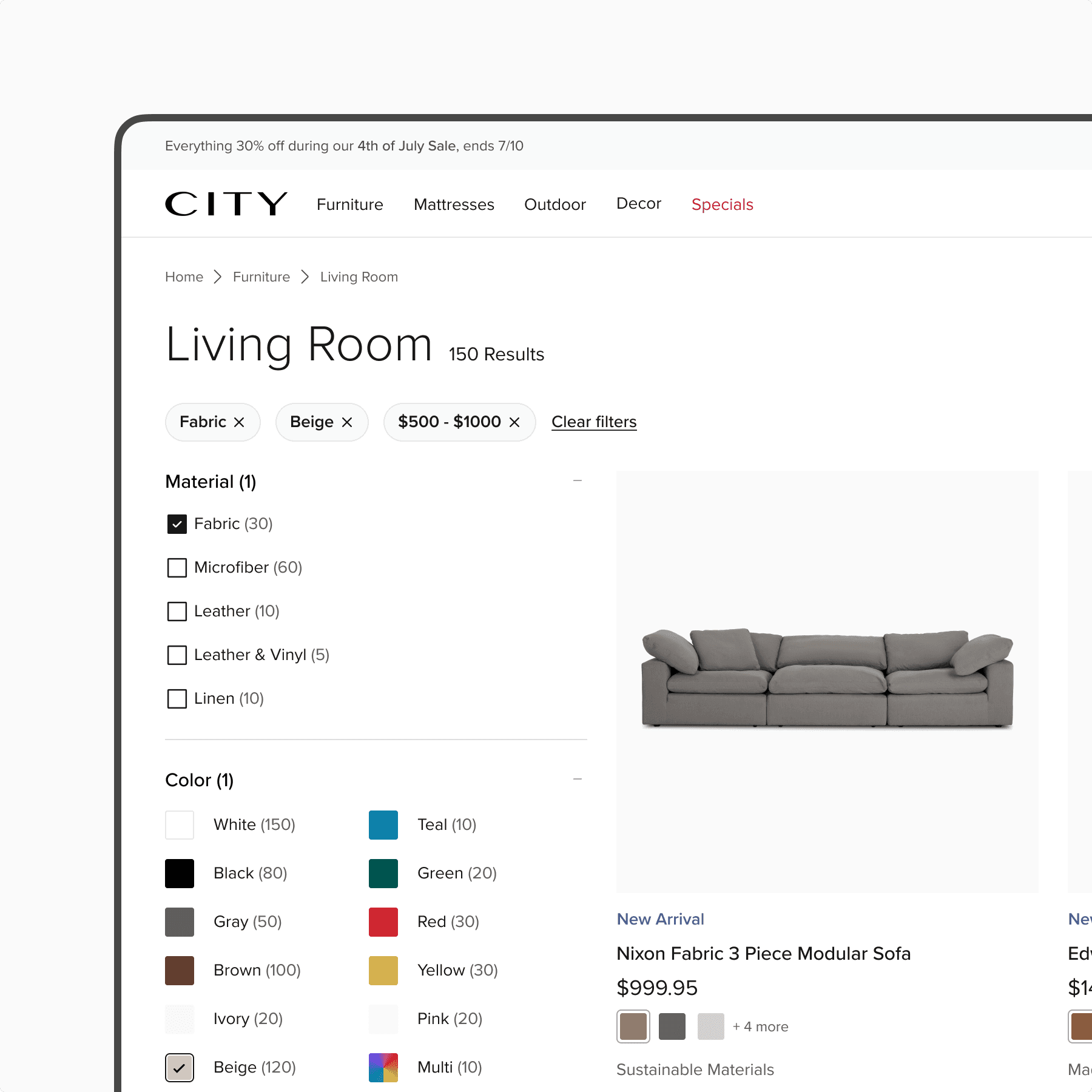
PLP rows
PLP rows
PLP rows
A clean, spacious layout with 3 items per row (down from 4), giving each product room to shine without overwhelming users. (Desktop only)
A clean, spacious layout with 3 items per row (down from 4), giving each product room to shine without overwhelming users. (Desktop only)
A clean, spacious layout with 3 items per row (down from 4), giving each product room to shine without overwhelming users. (Desktop only)

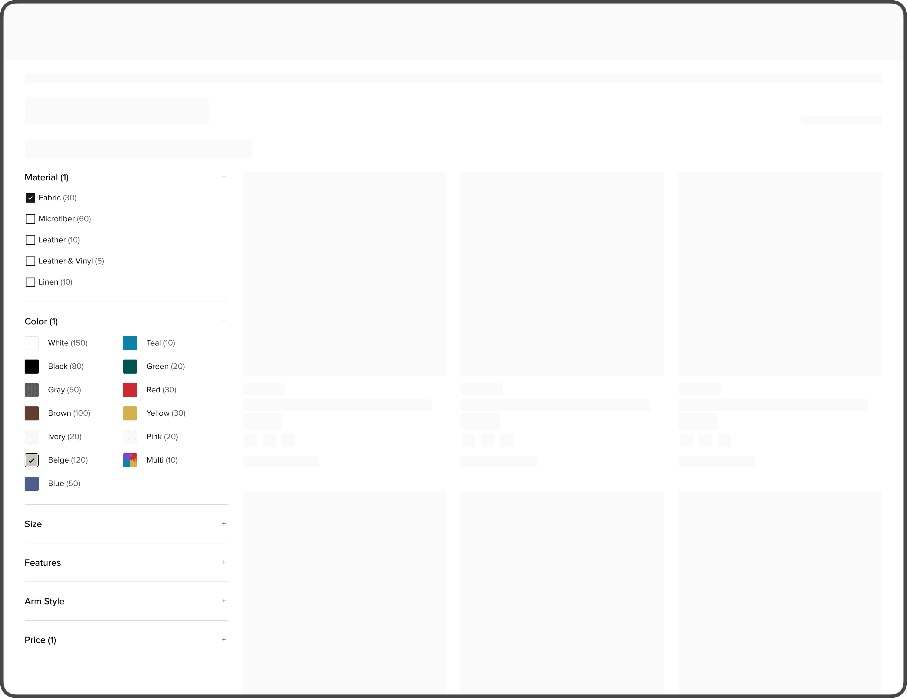
Left-sided nav (desktop)
Left-sided nav (desktop)
Left-sided nav (desktop)
A sticky left-hand filter rail that’s easy to access but stays out of the way, replacing the clunky top-menu approach.
A sticky left-hand filter rail that’s easy to access but stays out of the way, replacing the clunky top-menu approach.
A sticky left-hand filter rail that’s easy to access but stays out of the way, replacing the clunky top-menu approach.
Product cards
Product cards
Product cards
Larger product cards (1:1 ratio) with better imagery and prioritized details (like badging and swatch options), making it easier for customers to feel invited to evaluate pieces at a glance.
Larger product cards (1:1 ratio) with better imagery and prioritized details (like badging and swatch options), making it easier for customers to feel invited to evaluate pieces at a glance.
Larger product cards (1:1 ratio) with better imagery and prioritized details (like badging and swatch options), making it easier for customers to feel invited to evaluate pieces at a glance.

Filtering experience
Filtering experience
Filtering experience
Clearer labels and visual feedback so users know exactly what they’ve selected. The pills highlight selections made with the option to eliminate them one at a time or all at once.
Clearer labels and visual feedback so users know exactly what they’ve selected. The pills highlight selections made with the option to eliminate them one at a time or all at once.
Clearer labels and visual feedback so users know exactly what they’ve selected. The pills highlight selections made with the option to eliminate them one at a time or all at once.
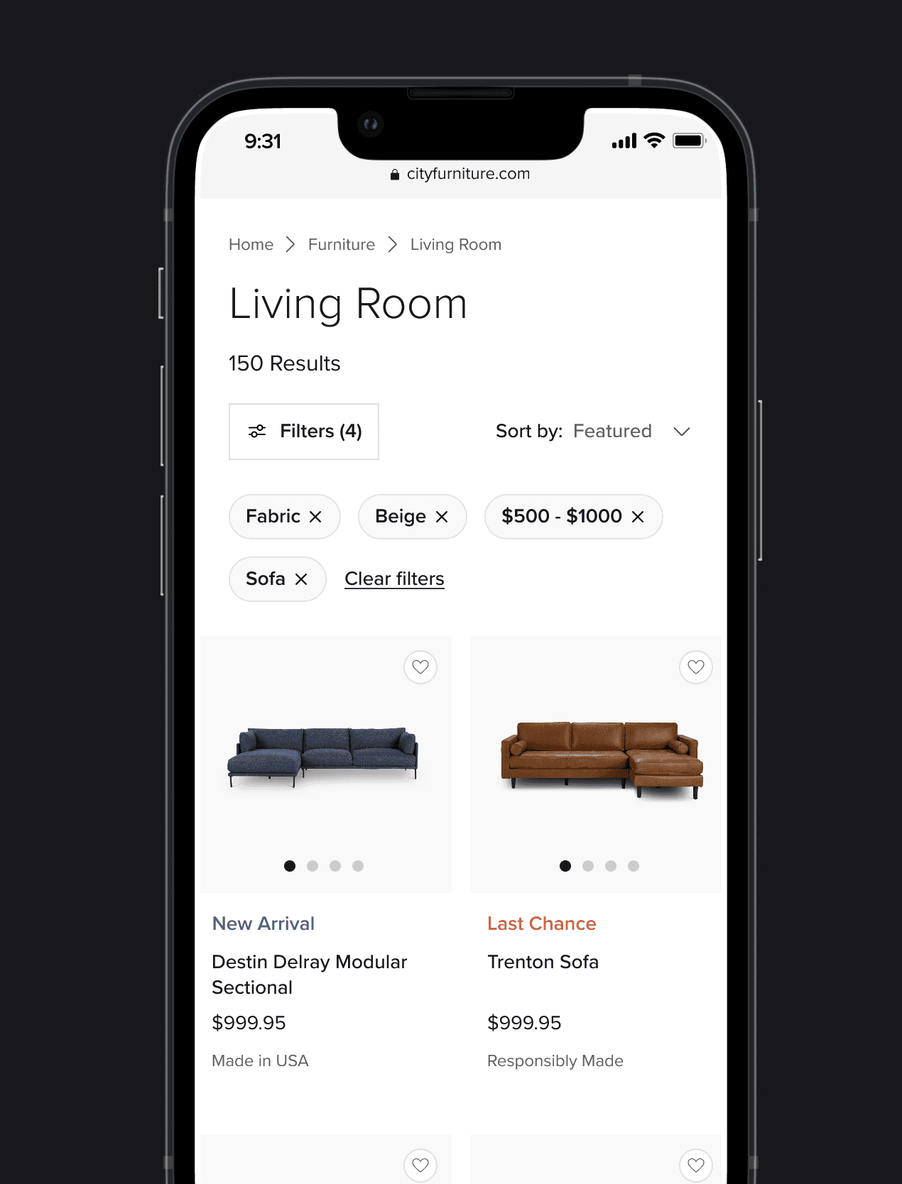
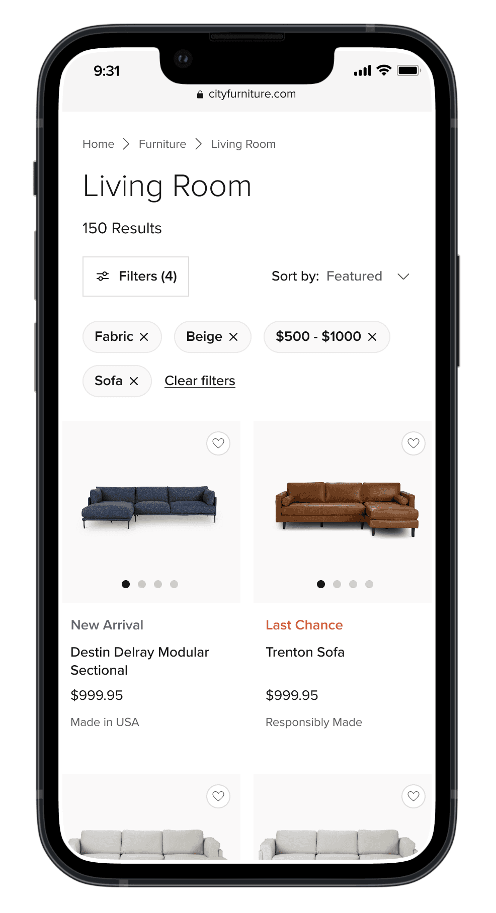
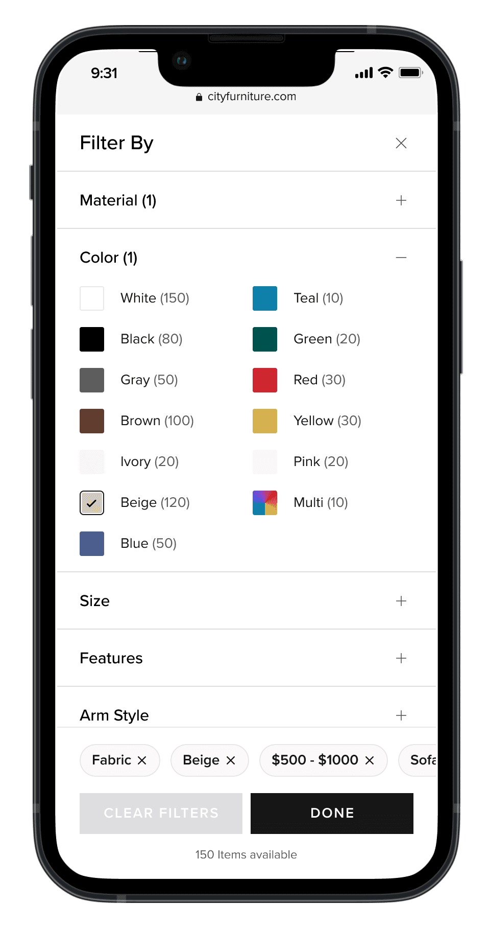
Filtering experience (mobile)
Filtering experience (mobile)
Filtering experience (mobile)
The same idea was carried over for mobile as well. The pill selections are visible on the PLP and the filter view.
The same idea was carried over for mobile as well. The pill selections are visible on the PLP and the filter view.
The same idea was carried over for mobile as well. The pill selections are visible on the PLP and the filter view.
Handoff
Handoff
Handoff
Working as a product team
Working as a product team
Working as a product team
Working closely with our development team through the process, we made sure everyone stayed aligned as the product took shape. Before moving forward, we came together for a few extra check-ins to fine-tune the most important interactions and user flows. Keeping communication smooth and clear for everyone involved.
Working closely with our development team through the process, we made sure everyone stayed aligned as the product took shape. Before moving forward, we came together for a few extra check-ins to fine-tune the most important interactions and user flows. Keeping communication smooth and clear for everyone involved.
Working closely with our development team through the process, we made sure everyone stayed aligned as the product took shape. Before moving forward, we came together for a few extra check-ins to fine-tune the most important interactions and user flows. Keeping communication smooth and clear for everyone involved.
Learnings & continued iteration
Learnings & continued iteration
Learnings & continued iteration
Working agile
Working agile
Working agile
The overall agile environment the team worked with in this project really gave us a faster, more flexible workflow–and a final product that truly reflected the team's and business' shared vision. This worked great because:
The overall agile environment the team worked with in this project really gave us a faster, more flexible workflow–and a final product that truly reflected the team's and business' shared vision. This worked great because:
The overall agile environment the team worked with in this project really gave us a faster, more flexible workflow–and a final product that truly reflected the team's and business' shared vision. This worked great because:
01
01
01
No surprises: Constant collaboration meant fewer last-minute fire drills.
No surprises: Constant collaboration meant fewer last-minute fire drills.
No surprises: Constant collaboration meant fewer last-minute fire drills.
02
02
02
Faster iterations: Small, frequent handoffs kept momentum high.
Faster iterations: Small, frequent handoffs kept momentum high.
Faster iterations: Small, frequent handoffs kept momentum high.
03
03
03
Shared ownership: Devs contributed to the design’s success, and designers understood technical trade-offs.
Shared ownership: Devs contributed to the design’s success, and designers understood technical trade-offs.
Shared ownership: Devs contributed to the design’s success, and designers understood technical trade-offs.
Our PLP today
Our PLP today
Our PLP today
Our PLP refresh made shopping smoother right away and the feedback helped us keep making it even better. The CITY Furniture team is still fine-tuning things, so check out how it’s evolved on our site here.
Our PLP refresh made shopping smoother right away and the feedback helped us keep making it even better. The CITY Furniture team is still fine-tuning things, so check out how it’s evolved on our site here.
Our PLP refresh made shopping smoother right away and the feedback helped us keep making it even better. The CITY Furniture team is still fine-tuning things, so check out how it’s evolved on our site here.
© Jaime Carrasco 2025 – Made in the U.S.A.
© Jaime Carrasco 2025 – Made in the U.S.A.
© Jaime Carrasco 2025 – Made in the U.S.A.
© Jaime Carrasco 2025 – Made in the U.S.A.